
Exercise 1.7 Sources and media
I was spending a couple of days in the high country of Victoria and was staying in a small country town set on an undulating plain surrounded by high mountains. I went walking along some tracks in a recreation area set on former gold prospecting land.


I collected some Australian native specimens as a source for drawing. They are a live eucalypt branch, a wattle branch and a collection of large dry eucalypt leaves. I was attracted to the leaves for their sheer size and variety of shapes as they lay on the ground.


I am going to try using watercolour pencils for drawing in this project. I have minimal use in this medium and think it may suit the subject matter. I will explore how to outline, how much water to add and how to blend colour. I like the transparent/opaque quality of watercolour but hope that by using a pencil to create that effect I will have more control over the lines or marks that I make. As I am away from home in a small town in the mountains, using pencils and brush is relatively easy to manage. I have A5 watercolour paper and A3 cartridge paper to use.
Exercise 1.8 Portraying by drawing
I decided to start by doing small individual watercolour studies in my A5 sketchbook.
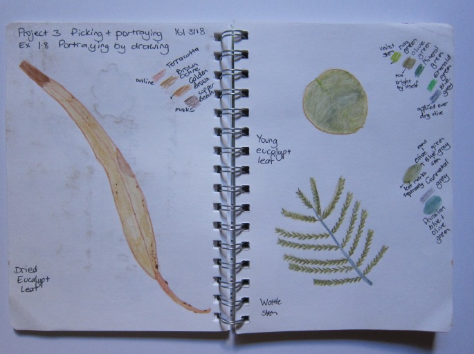
I was pleased with the dried gum leaf, I like the way I captured its line and my first attempt at using the watercolour pencils was reasonable. The fresh rounded eucalypt leaf was a bit of a non entity, its shape was uninteresting and the colour was one tone and too bright. I then applied a blue grey over the olive green which gave it a bit of interest. The veins which I had drawn in a lighter may green barely showed up. The actual surface and veins of this leaf are almost white but I didn’t quite know how to accomplish that. The wattle stem is ok, I like the way I captured the central stem and the individual leaves fanning out. I tried brushing water along the whole stem of leaves (top) but it just created a green smudge. I got a better result by brushing water onto individual pencil strokes.

I used repetition with the rounded leaf but again was disappointed with the result. The outline and veins and placement of the leaves is okay but there is not a lot of interest in the drawing. The green was too bright despite applying blue grey over the top and I find it boring to view.

I like this drawing for its simplicity, horizontal line composition and the shadow I incorporated. I found it really interesting how the same shaped leaves can look so different when viewed from a particular angle.

I dropped the dried leaves randomly onto the floor to replicate how they were found in the bush.
I then drew them on a white A2 cartridge paper background. I used graphite pencil first to capture the outlines and then outlined and filled in with watercolour pencil. I was really pleased with this drawing. I captured the outline and placement of the leaves. I really like the inclusion of the eaten out parts of the leaves. I like how the darker brown marks have slightly bled when the water was applied. I like how the infill colour shows watermarks creating a variation in the spread of colour. Unfortunately this was more by chance than design! I would like to be able to obtain this effect in a more controlled way.
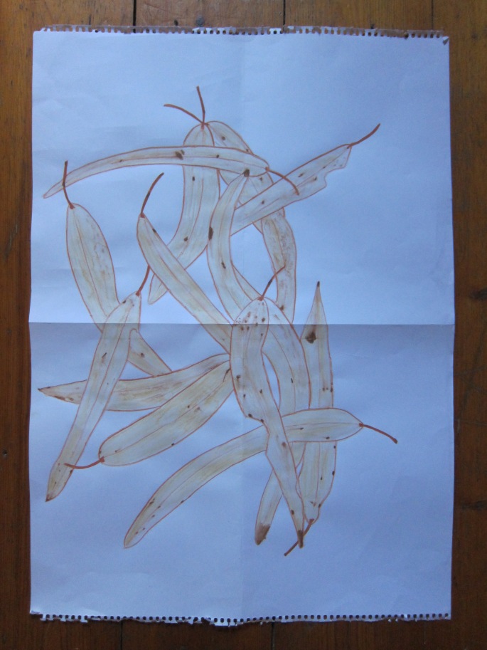


Once I had drawn these leaves and stood back and had a better feel for the lines created by the random placement of the leaves, I explored that a little bit further. I could almost do it without looking.


I used the watercolour pencils in bright colours to capture the line aspect. In the drawing on the left I used a wash over the top but I am not sure I like it as much as without the wash. It tends to dull the brightness of the lines. So in the second drawing I decided to apply water just along the lines and I like this result but am not so keen on the colours I used for the lines.
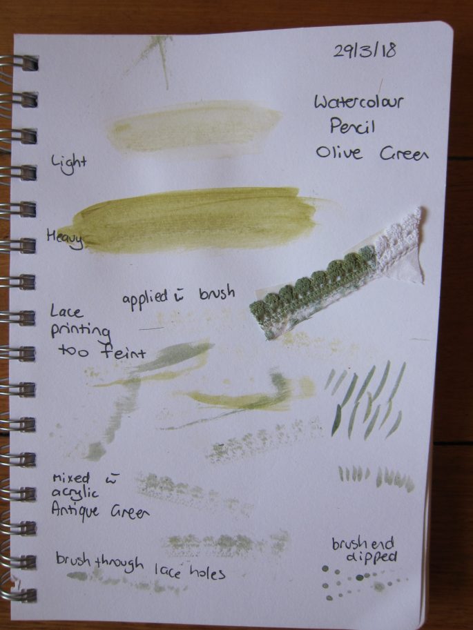
At the end of March I attended a 3 day workshop run by Cas Holmes, a paper, textiles and mixed media artist from the U.K. One technique I learnt was drawing using shadow so I tried this out when I returned home. We also explored the use of mark making, print, and colour using ink, watercolour and acrylic paint. This led me to some sampling prior to tackling my next group of drawings.
The following four drawings were all done by drawing a shadow outline first.

I am pleased that I managed to get some depth by lightening the ends and edges of the leaves, in the drawing above on the black background.

I am fascinated by the shapes of these leaves. I attempted to create some variation in depth of colour but have a long way to go in terms of creating depth in my drawing. I don’t like the visible pencil outline of the leaves.

I like the lacy effect of the drawing of the wattle branches and the placement on the right side of the page with the stems flowing toward the opposite side. It creates energy and movement in the drawing. I succeeded in using more than one tone of green for the stems and leaves.
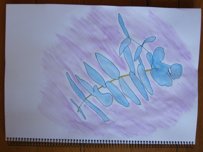
I was getting a bit sick of green so decided to take a risk and try using different colours. I still really like the shape of the leaves made by the shadow and I like the use of blue and yellow for the stem. I think the purple background wash complements the blue leaves, however, the application of the wash shows the brushstrokes too distinctly.

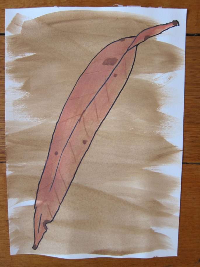
Inspired by Margaret Preston’s work, I used black thick liner to outline these two dried eucalypt leaves and watercolour pencil to fill them in and acrylic wash for the background. The single leaves were placed on A5 watercolour paper. I particularly like the one on the right for its colour and markings. I like the imperfections shown in the leaves creating irregular edges. The colour of the markings on the leaf on the left is too light and looks unnatural. The background wash on the right is nice and smooth whereas on the left is too dry. I wonder how these leaves would look if placed on a larger background.
