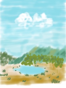
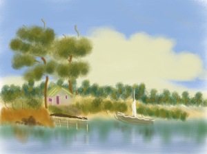
I was spending a couple of days in the high country of Victoria and was staying in a small country town set on an undulating plain surrounded by high mountains. I went walking along some tracks in a recreation area set on former gold prospecting land.
I collected some Australian native specimens as a source for drawing. They are a live eucalypt branch, a wattle branch and a collection of large dry eucalypt leaves. I was attracted to the leaves for their sheer size and variety of shapes as they lay on the ground.
I am going to try using watercolour pencils for drawing in this project. I have minimal use in this medium and think it may suit the subject matter. I will explore how to outline, how much water to add and how to blend colour. I like the transparent/opaque quality of watercolour but hope that by using a pencil to create that effect I will have more control over the lines or marks that I make. As I am away from home in a small town in the mountains, using pencils and brush is relatively easy to manage. I have A5 watercolour paper and A3 cartridge paper to use.
Exercise 1.8 Portraying by drawing
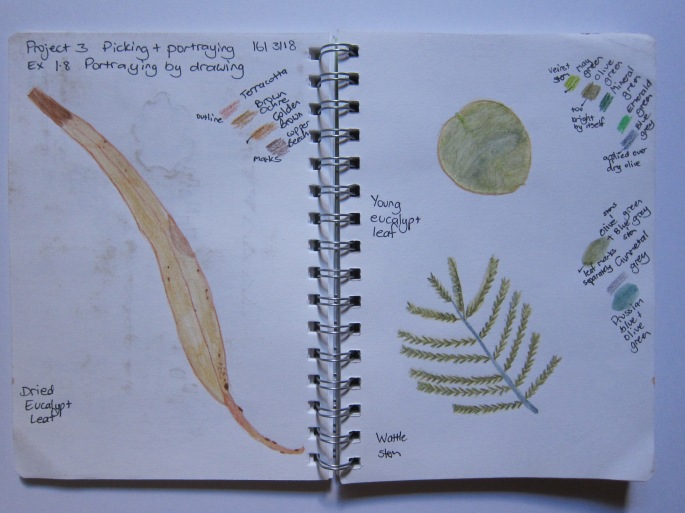
I decided to start by doing small individual watercolour studies in my A5 sketchbook.
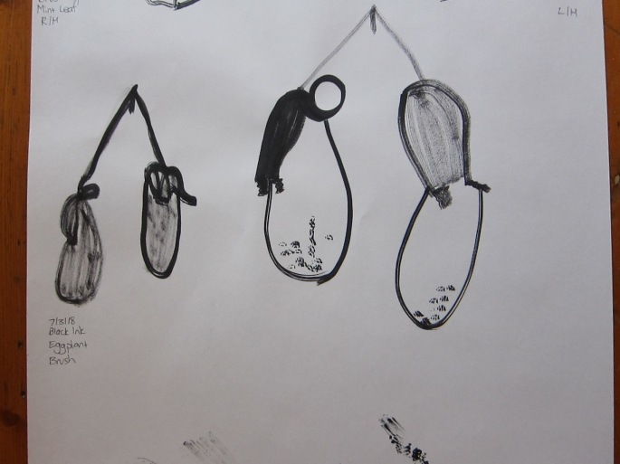
A5 sketchbook Watercolour pencil
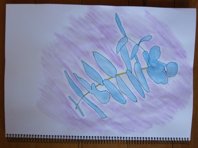
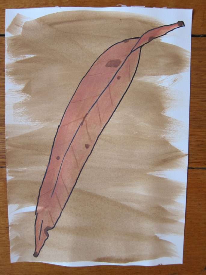
I was pleased with the dried gum leaf, I like the way I captured its line and my first attempt at using the watercolour pencils was reasonable. The fresh rounded eucalypt leaf was a bit of a non entity, its shape was uninteresting and the colour was one tone and too bright. I then applied a blue grey over the olive green which gave it a bit of interest. The veins which I had drawn in a lighter may green barely showed up. The actual surface and veins of this leaf are almost white but I didn’t quite know how to accomplish that. The wattle stem is ok, I like the way I captured the central stem and the individual leaves fanning out. I tried brushing water along the whole stem of leaves (top) but it just created a green smudge. I got a better result by brushing water onto individual pencil strokes.
A5 Sketchbook Watercolour pencil
I used repetition with the rounded leaf but again was disappointed with the result. The outline and veins and placement of the leaves is okay but there is not a lot of interest in the drawing. The green was too bright despite applying blue grey over the top and I find it boring to view.
A3 Sketchbook cartridge paper Watercolour pencil
I like this drawing for its simplicity, horizontal line composition and the shadow I incorporated. I found it really interesting how the same shaped leaves can look so different when viewed from a particular angle.
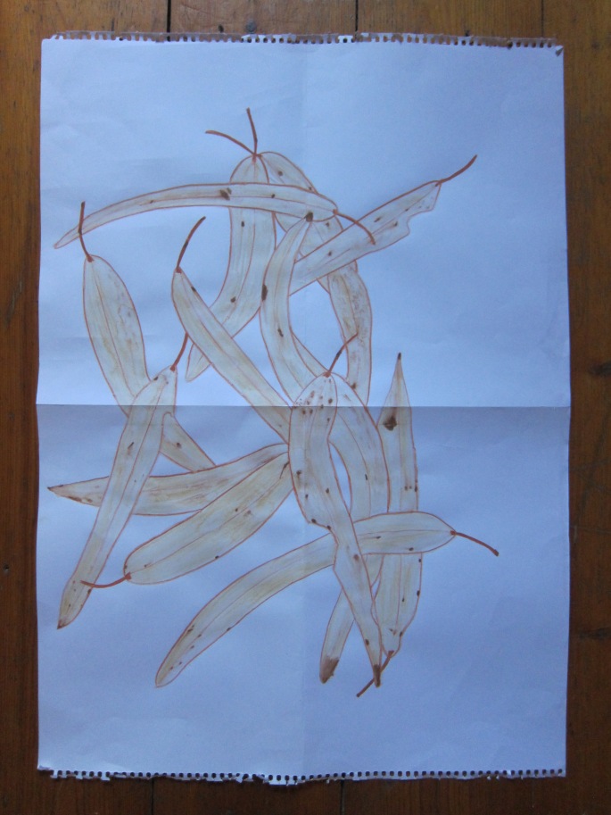
I dropped the dried leaves randomly onto the floor to replicate how they were found in the bush.
I then drew them on a white A2 cartridge paper background. I used graphite pencil first to capture the outlines and then outlined and filled in with watercolour pencil. I was really pleased with this drawing. I captured the outline and placement of the leaves. I really like the inclusion of the eaten out parts of the leaves. I like how the darker brown marks have slightly bled when the water was applied. I like how the infill colour shows watermarks creating a variation in the spread of colour. Unfortunately this was more by chance than design! I would like to be able to obtain this effect in a more controlled way.
A2 Cartridge paper Watercolour pencil
Once I had drawn these leaves and stood back and had a better feel for the lines created by the random placement of the leaves, I explored that a little bit further. I could almost do it without looking.
A5 Sketchbook
Watercolour pencil
I used the watercolour pencils in bright colours to capture the line aspect. In the drawing on the left I used a wash over the top but I am not sure I like it as much as without the wash. It tends to dull the brightness of the lines. So in the second drawing I decided to apply water just along the lines and I like this result but am not so keen on the colours I used for the lines.
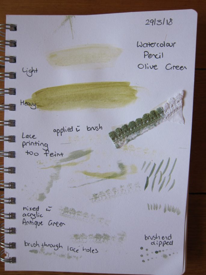
At the end of March I attended a 3 day workshop run by Cas Holmes, a paper, textiles and mixed media artist from the U.K. One technique I learnt was drawing using shadow so I tried this out when I returned home. We also explored the use of mark making, print, and colour using ink, watercolour and acrylic paint. This led me to some sampling prior to tackling my next group of drawings.
A5 Sketchbook
The following four drawings were all done by drawing a shadow outline first.
I am pleased that I managed to get some depth by lightening the ends and edges of the leaves, in the drawing above on the black background.
A5 Watercolour paper/Pencil
I am fascinated by the shapes of these leaves. I attempted to create some variation in depth of colour but have a long way to go in terms of creating depth in my drawing. I don’t like the visible pencil outline of the leaves.
I like the lacy effect of the drawing of the wattle branches and the placement on the right side of the page with the stems flowing toward the opposite side. It creates energy and movement in the drawing. I succeeded in using more than one tone of green for the stems and leaves.
I was getting a bit sick of green so decided to take a risk and try using different colours. I still really like the shape of the leaves made by the shadow and I like the use of blue and yellow for the stem. I think the purple background wash complements the blue leaves, however, the application of the wash shows the brushstrokes too distinctly.
A5 Watercolour paper/Pencil/Acrylic/Marker
Inspired by Margaret Preston’s work, I used black thick liner to outline these two dried eucalypt leaves and watercolour pencil to fill them in and acrylic wash for the background. The single leaves were placed on A5 watercolour paper. I particularly like the one on the right for its colour and markings. I like the imperfections shown in the leaves creating irregular edges. The colour of the markings on the leaf on the left is too light and looks unnatural. The background wash on the right is nice and smooth whereas on the left is too dry. I wonder how these leaves would look if placed on a larger background.
I have been a lover of Japan and its aesthetics since I first travelled there in 1981. This necklace that I bought there around 2005 is an example of the simple yet beautiful. It is a polished piece of wood attached to a black leather thong with a brass fitting. I am also drawn to nature and natural materials in clothing and furnishings.
There were a number of points in Koren’s text that resonated with me beginning with his definition that the closest word in the English language is ‘rustic’ which, for me, conjured up images of rusted metal; worn but beautiful. This is an interesting idea to entertain in light of the differences Koren espouses between Modernism-control by nature, and Wabi Sabi-uncontrollability of nature. Metal objects become rusted through exposure to moisture in the air, and in doing so, can be seen as a thing of beauty, or ugliness, either way, will eventually disintegrate, unless treated by galvanisation or paint. Koren’s metaphysical basis of Wabi-Sabi refers to this in terms of things devolving toward or evolving from nothing. Nothing is permanent nor is it perfect.
In respect of this textiles art course I related to Koren’s material qualities of Wabi-Sabi; natural process, irregularity, intimacy, unpretentious, earthy, murky and simple. I could visualise several qualities in various objects I have studied. The irregularities in the brown markings on the skin of the eggplant, the frayed nine patch block pieces, the holes in the poncho and the imperfections in the dried eucalypt leaves are all a result of a natural process.
Fraying
Graphite A5
These simple items are unpretentious and hold an intimacy with their past. They have an earthiness directly or indirectly connected with their raw materials, although, the fabric in the bedcovers and the woollen thread have gone through a number of processes. If left to nature they would revert to nothingness through wear and/or decomposition.
I am coming to appreciate the beauty in imperfection and how it can become a source for design. It reminds me of the lyrics: “There is a crack in everything (there is a crack in everything) That’s how the light gets in” from Leonard Cohen’s ‘Anthem’.
The purse manufactured by the Lisu people cannot be examined in the same light as the items above. It has been constructed from commercially produced synthetic materials and does not have the degree of history that results in wear and tear. I find it ironic that this item, that is connected with such an ancient people, does not fit the definition of Koren’s Wabi-Sabi. However, if I was to study an item produced by the Lisu people prior to the arrival of tourists in their community in the 1970s, it would be very different.
Wabi-Sabi trend
I discovered these articles when searching for information for Wabi-Sabi. Isn’t it ironic? The idea that Wabi-Sabi can be ‘manufactured’ as a trend for home decor. I wonder if this will destroy its very essence and integrity.
“The good news is you can stop ironing your sheets (if you ever did!) and making your bed every day, as wabi-sabi is all about the crumpled ‘slept-in’ unmade look. Bonus points for layers of soft wrinkled worn linen sheets to help create that effortlessly undone feel.”
This made me laugh, or was it relief that I didn’t have to make the bed and I would be on trend, or is it cringeworthy!
Reference List:
Koren, L. (2008). Wabi-sabi for artists, designers, poets & philosophers. Point Reyes, California: Imperfect Publishing.
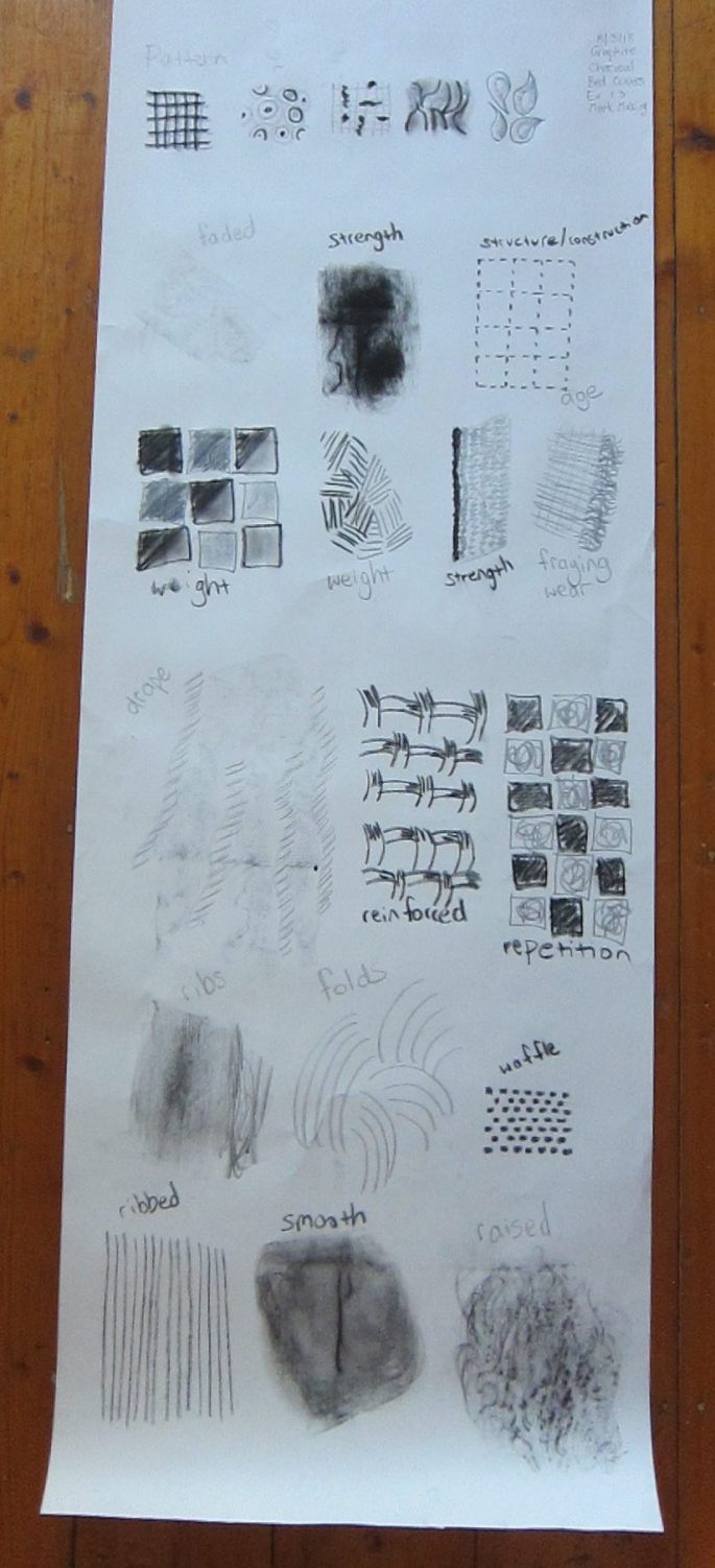
Firstly, I recorded the types of marks that would capture different aspects of the textile items, using the list of qualities listed on Page 32 of the course guide.
Bedcover
Mark Making Bedcover Charcoal Graphite 50 x 150cm
I used charcoal and graphite stick to make marks for the bedcover. I inadvertently discovered the creation of texture through placing fabric behind the paper and rubbing. I like the ribs it created (left-second from bottom) and the raised effect (bottom right). The graphite drape marks including short horizontal marks in a vertical line, and the shading are effective. The repetition marks of the nine patch pattern is effective and now that I have a photo in black & white I can see further exploration of this on a larger scale to create darker and lighter areas. The weight marks (2nd from left) show this quality more effectively than the shaded nine patch to its right. I really like how the charcoal vertical mark on the edge of the graphite marks shows the quality of strength in the backing. The blocks showing the quality of individual block patterns are effective. I would like to explore how to incorporate the qualities of the variety of patterns in the whole item.
Purse
Mark making Purse Permanent marker 50 x 75cm
I decided to use a black permanent marker for these marks but I don’t particularly like the clean lines it gives. The qualities in this item were less than for the bedcovers so I felt a bit limited. The solid infilled smooth curved forms depict that quality well. I wanted to show the spikiness of the zip teeth but am not sure that this mark suggests that strongly. The silkiness of the cord thread was also difficult to show although I am reasonably pleased with this. I really like the broken lines that show the lightness of the item and the mark that suggests reinforcement. I used layered Xs to show the solidness of the purse interior and the base of it and think it is successful. I felt limited in the ways in which to make marks to show repetition and pattern, other than the design itself. I like how the regular broken repeating lines relate to the machine stitching.
Poncho
Mark making Poncho Black Ink Graphite Cardboard 50 x 150cm
I am really excited by some of these marks. I like the horizontal row of circles connected by short vertical marks, that depict the quality of repetition in the pattern, although they are irregular. It is strong and has different degrees of not/solid brushstrokes. I also like the broken irregular solid marks in a circle to suggest the lack of elasticity in the poncho neck. I think the angled marks from narrow to wider showing the strength of the thread ply has a lot of energy. The radiating lines in a circle are effective but so regular. I used the same technique, to show the drape of the poncho, as I used with the bedcover; a vertical back and forth movement to create the line and dragging the ink across the paper to create the infill. Again I tried rubbing the garment with graphite to show the lace pattern which looks more obvious in the photo above than I had noticed on the paper. I was disappointed with the circular marks I made with a cardboard disc to show the structure of the poncho. The horizontal line marks inside the circle do not show the more complex structure of the crochet. I like the marks that show the detail of the crochet design.
I found it challenging to use a range of marks together to draw a complete piece. I thought that using too many types of marks would end up looking too busy and losing the integrity of the item. Using too few marks would not show all the qualities of the item.
Bedcover
Graphite Charcoal 50 x 150cm
Graphite Charcoal 50 x 40cm
I decided to use the drape and strength marks to show the overall fall of the bedcover. I chose to use the weight mark combined with the repetitive nine patch, minimally, to highlight the structural design of the bedcover without losing the drape. I chose one nine patch block to focus on some detail and used the repetition, structure, fraying and the rib marks. The horizontal charcoal zigzag marks (from the purse mark making) show the strength of the bedcover background, which holds the bedcover together, however they dominate the drawing which is not actually the case as the background fabric is a light colour. I like the suggestion of the regularity of machine stitching in the marks that surround the block.
Charcoal 45 x 90 cm
I am quite disappointed with this large charcoal drawing. It reminds me of ‘Snakes and Ladders’ with ugly snakes slithering along! The ‘snakes’ were supposed to show the drape of the quilt as it lay on the floor. I thought I had a better idea of the line of the pieces, as I had already completed my bedcover collage but really struggled depicting that. I was going to fill in the nine patch blocks with pattern but decided to abandon this drawing. 😦
Charcoal 45 x 15 cm
I seemed to be able to capture the line of the blocks and their overall intensity of the various pieces in the nine patch in this charcoal drawing. I admit that I referred back to my collage as I could clearly see the lines of the pieces in it. I am pleased with the marks I used as I think they capture the feel of the different blocks in terms of density of pattern and the tone.
Purse
Charcoal 50 x 100cm
I am pleased with the use of the Xs mark to represent the solid bands at the top and bottom of the purse. I think the silky mark suits the hang and the texture of the purse cord. The spiky mark representing the zip is effective. I am disappointed with the horizontal pattern design and not surprisingly as I found it difficult to find marks to represent it, other than simply replicating it. I think the use of the reinforcing mark and the smudged charcoal on the view of the base is effective. I would like to create another way to represent the design.
Black ink diluted Cardboard 45 x 20 cm 45 x 10 cm
I really like both of these drawings of the purse from a top view and deconstructed. I like the variation in the marks, some solid and some dragged. I like the layout of the elements and the variety of lines. I really enjoy working with cardboard and ink because it gives a more rustic look due to the variation in pressure applied to the paper as the mark is made.
Poncho
Black Ink Cardboard 45 x 90 cm
I am really happy with the way I have captured the qualities of the poncho in the drawing on the left. I like the use of the marks to show the fall of the garment and the circular and connection marks to represent the pattern. The neck of the poncho could be explored further as I like it as is but am not sure that it suggests the more closely positioned stitches.
Lace Black Ink Wash Stamp
Lace Black Ink Wash Stamp
Black Ink Cardboard Lace & Bottle top stamp 45 x 90 cm
After creating earlier marks made by rubbings and not being satisfied with the cardboard disc stamp I tried using real lace to stamp marks. I had to dilute the black ink to make a wash. The first sample (left) was not suitable as the lace was too fine to suggest the heavier texture of the wool. The second sample (right) including the bottle top ring was worth exploring. I also wanted to show the butterfly type outline of the poncho and I think the cardboard scallops are very effective. I like how on both drawings one side of the outline is solid while the other is not. I am disappointed with the overall look as the lace stamping is too delicate to suggest the heavier woollen thread. The circles stamped over look awkward and don’t suggest negative spaces in the pattern as I would like. Perhaps if I had removed the centre of the lace stamp it would give a better result. The scraping of the cardboard is effective in creating the heavier neck section as it is somewhat more solid than the first drawing. I would like to explore the idea of making a type of stamp that would more accurately suggest the heaviness of the woollen thread.
Black ink diluted Lace Stamp 45 x 55 cm
I am really pleased with this drawing which I made a couple of weeks after the previous ones. I made a stamp with the same piece of cotton lace and used black ink diluted with water. It gave a different effect to the earlier drawing as mainly the centre of the lace was . I like that the folds are visible as the poncho hangs and the heavier look along the base where the darker colour is. I am unsure about the neckline marks which I made with cardboard as they contrast with the more delicate stamping marks. The neckline in reality is quite different to the rest of the garment. I like that the marks are undefined giving it more of the woollen thread feel. The marks have a scalloped appearance and there is a suggestion of light/dark along the rows.
Exercise 1.4 Lines and edges
Top Graphite pencil Middle Earth pigment Bottom Charcoal 45 x 120 cm
Continuous line
I attempted to capture the lines and edges of the bedcover, which was draped over a chair, using charcoal (bottom), earth pigment applied with a cotton wool ball (middle) and graphite pencil (top).
I drew a continuous line for the outline in the bottom drawing. I used diagonal lines for the folds and back and forth lines for the patch blocks. I like the overall look of this drawing because it bold and strong. The patches are interesting as a variety pressure and angles have been used to draw the lines.
The fuzzy line in the middle drawing is appropriate to represent the softness of the bedcover and the dabs of pigment representing the patches, however, it reminds me more of the poncho. I think this medium and application could be further explored.
I used a continuous graphite pencil line to draw the outline of the bedcover in the top drawing. I then used a dashed line to show the pieces in the nine patch blocks which I think is quite effective. I tried to concentrate on the different angles the blocks were at due to the fall of the bedcover.
Right hand/left hand
Right Hand Charcoal 45 x 60 cm
Left Hand Charcoal 45 x 60 cm
The lines in the right hand drawing, which make a diamond shape, are more representative of the negative space in the poncho pattern. I like how they are uneven although the actual crochet is quite even. I like the effect of the short angled vertical lines in the neckline, again not even.
I decided to use more of a scallop line with my left hand as it better represented the pattern. By the time I got to the last few bottom rows I was quite bored and started drawing the lines more randomly. I don’t think the outcome is any better although I do like the curly lines on the right hand bottom side.
Right Hand Bottom Left Hand Top Earth pigment 45 x 120 cm
I was not very satisfied with my poncho line drawings so decided to take a different approach. I stayed with the open, flat poncho as I love the form it makes. I used earth pigment mixed with a little water, an old paintbrush and a rounded pastry brush. I dabbed on the medium using the paintbrush for the darker lines and the round brush for a lighter effect. I was really pleased with this drawing as the darker and lighter lines of marks show the layout of the poncho very effectively. I then repeated the same process with my left hand. I prefer the right hand drawing as the lines of marks are more defined.
Drawing with eyes closed
Earth pigment 45 x 120cm
I quite like the blind drawing (bottom) although I did have to open my eyes to refill my brush midway through the drawing. I love the relaxed look of the lines and the bold line along the top which sticks out at the left hand edge. I like the scratchiness of the lines where the brush was becoming dryer, the suggestion of the triangular design and the cord which is less intense than in reality. I also tried drawing the base of the purse (middle) and love the bolder curved outline with the lighter straighter line infill.
I wanted to explore the scratchy effect further as it is the complete opposite to how the purse actually looks. I used a fine tea strainer with the pigment mix, now with additional water, so quite runny. It was very difficult to control the application and wasn’t a huge success and was very messy. I like the darker contrast of the more solid line at the top left of the purse and at the top of the cord.
Next I made a brush with a piece of polyester velvet furnishing fabric. (top) It was easier to apply the medium and gives a lovely soft line but I think it is really mundane next to the earlier drawings. The cord looks like it is made of beads.
Exercise 1.5 Collage and creases
Twin Bedcovers
When I was working out how to create a black and white picture, from a colour photo, of the bedcovers I discovered I could save it as a 16 colour bitmap file which highlighted the lighter and darker sections by using a colour palette of only 16. I printed this out and also the normal colour photo to use as customised paper for my collage. I decided to juxtapose the two images and represent the almost two dimensional quality of the bedcover. By weaving the coloured image through the 16 BMP image I was able to create a sense of depth while highlighting the rectangular form the item. I chose to retain the strip ends as I thought they captured the frayed nature of the bedcover and made the collage appear more three dimensional. I am very happy with the outcome of this collage as I think it captures different aspects of the bedcover effectively.
Paper digital print A4
At the same time as printing the whole bedcover photo I printed some 9 patch blocks A4 size. I was really keen to use them as paper for a collage and spent some time mulling over different ideas. I liked how the images showed the various aspects including folds and creases, frayed edges and tears. Initially I cut the 9 patch blocks and was really pleased with how the edge lines showed, not a regular square shape, but emphasised the various aspects. I thought by swapping pieces between blocks while maintaining the plain/patterned design these aspects would be further emphasised. It took numerous rearrangements to realise that the original 9 patch block pieces together actually gave a stronger sense of the form and drape. I think this collage is effective and I think there are numerous techniques that are yet to be explored using these images in a collage.
Paper digital print A1
I had printed out some individual nine patch blocks not exactly sure what I might do with them. I decided to cut them up and discovered that this showed up the line between the pieces distinctively. As I had taken the photo when the bedcover wasn’t flat it had folds and creases in it. I was really fascinated with the shape of the pieces and how ‘unsquare’ they were. I tried a couple of backgrounds, grey and white, but decided black gave clearer definition to the edge lines showing the line better. The collage was quite flat so I focused on the frayed, torn and worn pieces to cut to create some depth and texture.
I was really pleased with this result and can imagine taking just one piece to explore further.
This slideshow requires JavaScript.
Poncho
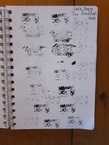
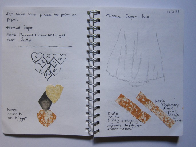
I created my own paper for the following two collages of the poncho. I drew on the lace printing idea from Making marks (above). I chose a heavier lace this time to give a denser texture which I think worked well. I mixed earth pigment with water and gel to made a printing medium which I used with archival paper. It took a few attempts to get the right consistency for printing successfully and I worked out that using a foam roller, a whole cotton lace doiley (not a small piece) or rubbing with my hand gave the best result. I am very pleased with the marks and like that they differ in intensity due to the amount of medium, the degree of pressure used and how dry or damp the lace was.
I deliberately focussed on a section of the poncho which included a larger area on the right side than the left so that the collage wasn’t strictly symmetrical. I created a regular (heart) shape template to represent the crochet design and cut small rectangular blocks of the printed paper for the neckline. I really like the effect of the overlapping blocks representing the woollen stitches. The heart shapes are a little stiff & perhaps a softer paper would be better to create the folds and drape but it would need to stand up to the printing process. When arranging the shapes I realised I could place them to suggest the heavier look along the bottom by using more densely printed pieces.
I placed the printed shapes on tissue paper which would create the folds and drape of the poncho. The tissue paper is very delicate and tore a little when I rolled and scrunched it but I don’t think that matters too much as it fits in with the item’s structure. I intentionally tore the tissue paper to create the edge line of the garment deliberately leaving it a little wider on the right hand side to complement the asymmetry I wanted to achieve. I am really pleased with the outcome of this collage as it shows the form, shape, drape and volume of the item.
Earth pigment stamped Tissue paper 45 x 60 cm
I was intrigued with how the crocheted neckline was quite different to the overall pattern and I wanted to capture that in a small collage although close to the actual neckline size. Despite looking at the poncho numerous times I had only just noticed a large hole where the sticthes had broken. I decided again to make it asymmetical to create more interest. I used the same hand printed paper and again cut small blocks and placed them slightly overlapping. Initially I thought I would place long strips but this didn’t capture the density of the stitches. To show the difference between the intact crocheted stitches and the hole where the stitches are broken I curled the pieces to represent the loose thread ends. I am really pleased with the outcome of this collage. I think it captures the qualities of the neckline of the poncho.
Earth pigment stamped A5
I was unhappy with the light blank hole in the collage, although, it did show the shadows extremely effectively. I decided to fill it in with darker stamped paper to represent the stitches on the underside that you would view if the poncho was folded. I am more satisfied with this result.
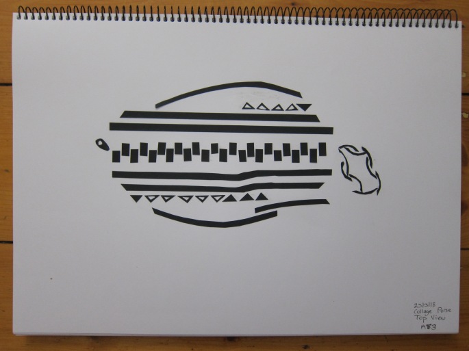
Purse
Black card A3
I wanted to focus on the top down view in this collage. I had already done the drawing with black ink and cardboard which I also used for a reference. I simply cut black card into the shapes I required and adhered them to A5 cartridge paper. This gave a clean white background for the defined black elements. I like the way the curved pieces make up the curved cord, next to the linear outlay for the body of the purse. I like the strong black rectangular pieces for the zip teeth with the curved zip tag at the end. I like the suggestion of curve in the upper and lower black stripes, and the indent in the stripes below the zip. This is a design I could explore further varying the linear/geometric elements and the bright coloured sections on the side of the purse.
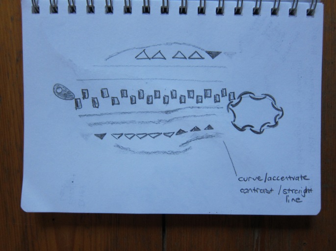
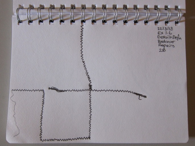
Exercise 1.6 Detail and definition
I chose to draw the detail and definition using graphite pencil in my A5 sketchbook and then a larger version in my A3 cartridge paper sketchbook.
Bedcover
It is visible where one of the bedcovers has been mended, particularly on the back, where green zigzag machine stitch is obvioius. It is a very simple zigzag line in effect but I like its simplicity, and the loose threads and the overstitching, which I tried to capture.
Graphite pencil A5
Graphite pencil A3
Graphite A5
Graphite A3
After making a collage of the bedcover’s fraying and tearing I wanted to explore it in detail. I used a graphite stick for these drawings as I wanted a softer effect. I like the spiral line at the edge of worn section and the scribbly line showing the loose and broken threads. This particular block piece consisted of a fabric that had a slightly raised design that was quite worn. The short vertical lines effectively represent these sections and very small ones show where the stitches connect to the adjoining pieces. I shaded the background and in the larger drawing shaded beyond the square to represent the ongoing space beyond this one piece.
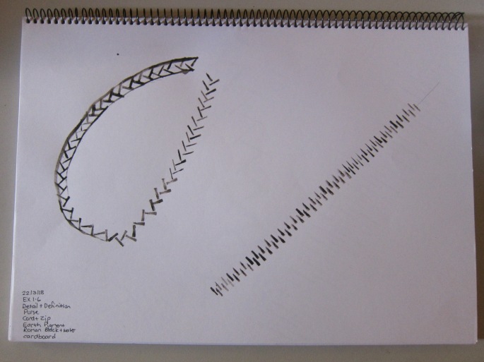
Purse
I used a thick black marker pen for the smaller drawing and am really happy with showing the detail in a simple yet clear drawing. I used Roman Black earth pigment mixed with water and applied it with narrow cardboard for the larger piece. I liked how the diagonal lines for the cord and the alternating lines for the zip looked clear, simple and ordered. I then started drawing an outline for the cord, as I had done in the smaller drawing, and it looked clumsy and spoilt the qualities already in the drawing. I decided to discontinue the border line.
Black marker A5
Earth pigment Cardboard A5
Poncho
I wanted to reproduce one section of the crocheted pattern in the poncho because I think looking at the stitch design is really interesting. I drew it in my A5 sketchbook first and was okay with the type of marks I used to capture the woollen thread and made a reasonable attempt at capturing the pattern.
Top Earth pigment String Middle Black ink Twine Bottom Earth pigment String 45 x 120cm
I made a stamp with string as I thought it would make lines representing the ply of the wool. I used it with the earth pigment and water mix which was quite runny. (bottom) I think the idea is creative but I really don’t like the overall look of the lines in the pattern as they are too disjointed. Perhaps a more random approach would have worked more effectively. I attempted to draw the line of the hole in the neckline of the poncho but again was disappointed with the lack of clarity. (middle)
I then used black ink with a much thicker plant twine (top) which was more successful in that the ink adhered to the stamp better. I liked the mark it made which made a representation of the lines of stitching in the neckline and is graduated in intensity. I used the end of the twine to create the line of loose threads around the edge of the hole.
I was very inspired after seeing Hockney’s tablet painting on large screens at the exhibition. There are some initial tablet paintings of mine in that blog post.
Hockney paints flowers on his device so that he can send them to friends daily. During 2009 Hockney’s partner would buy fresh flowers and Hockney would paint them on his device. He was drawn to painting luminous flowers which showed up well on the illuminated screen.
I have developed a little since then, practising by following a couple of ‘how to paint’ shows on TV. There are two styles here from two different painters; one quite a traditional style and the other using bright swathes of colour.
In Eastern art lush plants symbolise prosperity and growth while hardy plants indicate resistance to corruption. Other meanings were associated with individual flower motifs alongside their decorative function.
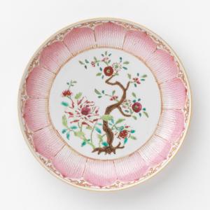
Dish (c. 1760) CHINESE Medium porcelain, enamel (famille rose ware) 3.3 × 20.5 cm diameter
Western art has depicted botanical images since its inception. As in Eastern art the floral motifs often had a meaning connected with them. Religion, mythology and medieval herbs have all been a source for plant symbolism as have the colours of flowers.
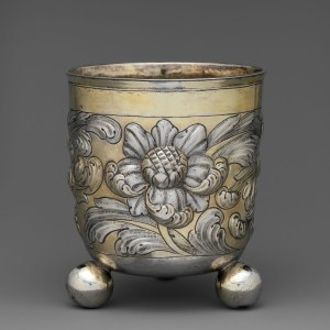
Beaker Date: late 17th century Culture: Hungarian, Rimaszombat Medium: Silver, partly gilded Dimensions: Overall: 4 1/2 x 4 in. (11.5 x 10.1 cm) Classification: Metalwork-Silver
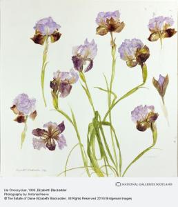
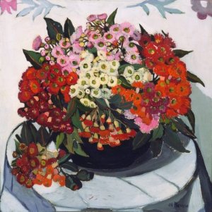
Blackadder is a Scottish painter and printmaker who works with a range of media including oil paints, watercolour, drawing and printmaking. An analytic, sometimes technical approach is evident in her flower and plant works allowing the underlying structure, design and colour harmony. She is well known for her floral watercolours, with her subjects primarily coming from her garden. A keen gardener, she paints what she loves and respects. When she was a child Blackadder would press flowers and record their latin name. She began sketching lilies from her garden in 1979. Blackadder is known for the consideration of space between objects in her compositions. She was more focused on painting flowers during the 2000s, developing her use of colour, which together with more spatial depth, gives the objects a more realistic appearance.
Summer Flowers
Dame Elizabeth Blackadder
WILD FLOWERS
Elizabeth Blackadder
Print
Medium Screenprint
73 x 89 cm
Autumn Leaves and Seed Heads, watercolour, by Elizabeth Blackadder,
64 x 97 cms
I really love the soft colours, delicate nature and composition of Blackadder’s floral paintings, which she manages to capture, along with the detail. I also like her placement of objects in the three examples above, which reminds me of my horizontal linear arrangement in the Introductory project for Part one.
William Morris (1834-1896)
Drawing England (made) ca. 1856 (made) Morris, William Pencil drawing
I have found Morris’ work appealing for many years. Morris became interested in the medieval era when studying at university and later on developed an interest in the Pre-Raphelite painting style. He is of course notable for his influence in the Arts and Crafts movement in the U.K.
Morris’ floral work was inspired by earlier sources including illustrated flower books. His tile designs drew on the Dutch tradition of blue and white tiles from the seventeenth century. Medieval patterns also influenced his tile designs.
Tile Place of origin: London (decorated) Netherlands (made) Date: 1862-1875 (made) ca. 1862 (designed) Artist/Maker: Morris, William, born 1834 – died 1896 (designer) Morris, Marshall, Faulkner & Co. (decorator) Materials and Techniques: Hand-painted on tin-glazed earthenware
Great Britain (decorated) Date: ca. 1870 (made) Artist/Maker: Morris, William, born 1834 – died 1896 (designer) Morris, Marshall, Faulkner & Co. (makers) Materials and Techniques: Hand-painted in blue on a tin-glazed earthenware Dutch blank
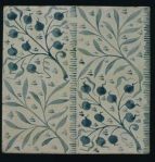
In his initial Daisy design Morris was again influenced by medieval sources such as the fifteenth century manuscript of Froissart’s Chronicles which inspired embroidered curtains and Chaucer’s ‘Legend of Good Women’ resulting in decorative hangings. These led to Daisy wallpaper in a range of backgrounds.
Wallpaper Place of origin: England (printed) Date: 1864 (produced) 01/02/1864 (design registered) Artist/Maker: Morris, William, born 1834 – died 1896 (designer) Morris & Co. (publisher) Jeffrey & Co. (printer) Materials and Techniques: block-printed in distemper colours, on paper
A pair of hand knotted Italian lacis panels were the inspiration for Morris’ small rug ‘Flowerpot’ design along with ‘Lily’ carpet, firescreens and cushion covers.
Lily Carpet: Place of origin: England (Woven) Date: 1878-81 (Produced)Artist/Maker: Morris, William, born 1834 – died 1896 (designer) Morris & Co.
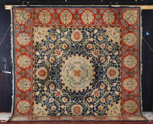
Said to be Morris’ most conservative design, ‘Swan House’ is strongly associated with traditional Persian carpet design as it features a central medallion and a large ornamental border such as those found in sixteenth and seventeenth century Turkish carpets.
‘Swan-House’ Hammersmith hand-knotted carpet, Morris & Co. , c.1890 (textile) by Morris, William (1834-96); 39.6×38 cm
Morris loved nature and mythology as seen in the famous ‘Woodpecker’ tapestry from 1885, depicting a bird and a woodpecker sitting in a tree with garlands of flowers and leaves swirling about, based on ‘Metamorphoses’ by the Latin poet Ovid.
Merton Abbey, Surrey, England 1885 307 x 156 cm Textile Wool on cotton lining
Later in his life Morris drew intricate flower patterns which demonstrated naturalism and depth along with flowing stylised foliage.
Wallpaper Place of origin: England 1881 (printed and published) Morris, William, born 1834 – died 1896 (designer) Jeffrey & Co. (manufacturer) Morris & Co. (publisher) Block printed in distemper colours, on paper
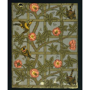
Morris produced an early wallpaper design including rose trellises said to be based on his own garden and used in his own house, although, trellises had previously been popular in other wallpaper designs.
Wallpaper Place of origin: London (printed) 11/1862 (designed (pattern)) 01/02/1864 (design registered) 1864 (manufactured) Artist/Maker: Morris, William, born 1834 – died 1896 (designer) Webb, Philip Speakman, born 1831 – died 1915 (designer) Jeffrey & Co. (printer) Morris & Co. (publisher) Block-printed in distemper colours, on paper
A boating trip along the Thames in 1880 inspired Morris to design a series of complex chintz patterns naming them after tributaries of the Thames. This trip also featured in his novel ‘News from Nowhere’.
Evenlode Textile design Britain (made) 1883 Morris, William, born 1834 – died 1896 Black chalk and bodycolour
William Morris clearly was influenced by a variety of sources both personal and otherwise that resulted in a wide body of work primarily for furnishings. The floral and leaf motifs that he used repeatedly in his designs were extremely popular at the time and still are today. Morris concentrated on British plants and blooms and his company produced items that eventually became more accessible through mass production.
I have always liked Morris’ designs for their focus on nature, repeated motifs, soft colouring, symmetry and stylised three dimensional look. His designs repeat these qualities whether on tile, dyed and woven textiles, or block printed on wallpaper.
Margaret Preston (1875-1963)
Portrait of Margaret Preston, c1924, by Harold Cazneaux
Preston was an Australian artist and although she is not on the course recommended list I wanted to research her work which is significant. She is known as an early modernist from the 1920s to the 1950s and well known for her intensely coloured botanical still lifes featuring Australian native flora. Her decorative style was influenced by Chinese, Japanese ukiyo-e printing and Australian Aboriginal art. Her work is notable for its black outlines and bold geometric shapes, often in the form of woodblock prints.
During the 1930s Preston lived in Bushland north of Sydney which influenced her work and gave her access to flora in its natural state, not purchased from a florist. She believed that colour was a marker for change and that art had to be accessible to the whole nation. Art needed to be modernised and Australia needed its own school of design and treatment of the way native flora was depicted. Her process when painting was to dissemble the flower, study its parts and then paint her compositions away from the object. Late in her life Preston produced works combining ideas gathered in her lifetime using a stencil technique.
Australian wild flowers 1923
Native pea
Mosman Australia
Painting
oil on canvas on cardboard on hardboard
42.5 x 42.0 cm board; 53.6 x 53.7 x 5.5 cm frame
Australian gum blossom 1928
Painting
oil on canvas
55.5 x 55.5 cm stretcher; 69.0 x 69.0 x 7.0 cm frame
Western Australian gum blossom
1928
Painting
Materials used
oil on canvas
55.3 x 46.0 cm stretcher; 55.0 x 44.7 cm sight; 68.4 x 58.1 x 4.0 cm frame :
0 – Whole; 54.6 x 44.5 cm; SIGHT DIMENSION
Wheel flower
(circa 1929)
Print
wood engraving, black ink, hand coloured in gouache on brown mulberry paper
Edition
2nd copy
44.1 x 44.6 cm blockmark; 56.0 x 45.5 cm sheet
Waratahs etc
(circa 1949)
Print
colour stencil, gouache on thin black card
Unknown edition, printed in colour
40.6 x 31.9 cm sheet
Sturt’s desert pea
(circa 1930)
Print
woodcut, printed in black ink, hand coloured in gouache on thin cream Japanese paper
Edition
5th proof from an unknown edition, hand coloured
‘Rock lily. [Native orchids]’ 1953 printed in colour from one hand-cut paper stencil
Still life
1950 Sydney, New South Wales, Australia
prints, stencil, printed in colour inks, from one hand-cut paper stencil
Edition: unknown, possibly 3
printed image 34.0 h x 37.8 w cm sheet 36.2 h x 40.2 w cm
Protea.
[Waratahs.]
1925 Sydney, New South Wales, Australia
prints, ink; paper woodcut, printed in black ink, from one block
Impression: 4/50
Edition: edition of 50, uncoloured; edition of 50, hand-coloured
Printed image 24.6 h x 24.2 w cm sheet 29.5 h x 27.5 w cm
I really like Preston’s style of depicting native Australian flora. It has strength through the linear composition, the choice of bold colour with a flat surface and the clear black outlines.
Clearly these three artists had a personal affinity with flora which is why they used it repeatedly in their artwork. They also used it in a decorative way and in doing so brought floral art to the wider community.
Reference List:
Long, P. (2011). Elizabeth Blackadder. New Haven ; London: Yale University Press in association with National Galleries of Scotland.
Zaczek, I. (2002). William Morris. Bath, U.K.: Paragon.
My drawing skills have definitely developed since twelve months ago when I began the Foundations Textiles course. I felt freer in my mark making although I think that I have focused a lot on form and could build my skill at capturing textures. I viewed and recorded my collection in a number of different ways using a variety of media, paper and page sizes.
I like the teabag paper as an earthy background but am not sure that it adds anything to the qualities of the items. Perhaps with further thought and ideas it could prove to be valuable.
I am especially pleased with the A2 gourd in pencil and the A3 gourd in permanent black marker. They both capture the organic form and the distinctive skin patterning. The patterning is a great source for exploring mark marking using different media which I proceeded to do with graphite and black ink wash. I could develop these aspects further.
I used pencil, graphite and ink wash to depict the corded cotton fabric but was most pleased with the vertical linear marks with small horizontal marks rather than the crosses I used in the pencil drawing. I think the former captured the texture of the fabric better.
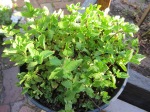
The serrated edges of the mint leaves made for an interesting feature which I explored with graphite on A2 cartridge paper. This is something I could further explore.
I liked the chilli sketches in 4B pencil and in graphite as they showed the undulating surface and light and shadow well. This aspect along with the uneven edges and variety in their form could provide material for further development.
I also like the black ink wash curly gourd as it is simple but clearly shows the form of the vegetable. I was interested in exploring the gourd flower, however, it shrivelled quickly as time passed. I was fascinated with its tiny white hairs and tried to represent them by using brush dabs with black ink wash.
Post video call feedback
Following a video conference with my tutor I had another go at capturing my Nature’s Larder.
She recommended getting out of my sketchbook and drawing BIG with charcoal and ink, revisiting some techniques from my Foundation year such as continuous line and blind drawing and I used left hand/right hand also.
Firstly I had to engineer a setup on my study wall to facilitate drawing on this scale! I have already refined it and am happy with the results. It felt so much freer to draw on a larger scale. I enjoyed using both the charcoal and the black ink although the charcoal is very messy! I love the smooth flowing feel of drawing with the ink. I used a range of tools including different size brushes, cotton bud and a dried teabag.
Drawing 1
I like the strong curve of the curly gourd but dislike the surface marking as it is too vague. The blackness of the other objects makes a strong statement and the spring onions on the right hand edge balances the composition. I don’t think any of the other marks are significant.
Drawing 2
This was drawing blind and there is a disconnect between each object and within them. I like the clover like mark of the mint and the soft leaf shape of the basic. Again the spring onions finish off the linear arrangement strongly.
Drawing 3
I started to use some rubbing of the charcoal in these right/left hand drawings as I wanted to create some surface texture but I don’t think it was very effective. I really like the l/h curly gourd flower as it is strong and defined. I also think the l/h chillies with their irregular piecing is interesting. I notice that the l/h drawings are larger than the r/h due to the degree of control I have.
Drawing 4
This is where I have started to further explore the curly gourd and I like the collection altogether. I started focusing on the inside negative space and discovered the teardrop/speech bubble type shape. I like the three drawings of the gourd from different angles, again interesting shapes in themselves. I like the effect of the charcoal rubbing in the first of these three. The marks radiating out from the base of the gourd are effective too.
Drawing 5
I challenged myself to draw single leaves BIG by examining their features closely and although the drawings themselves are insignificant I learned a lot about the similarities and differences between two versions of the same object. I like the form of the chilli cap at the bottom left of this set, simple and curved. I also like the single serrated horizontal line of the mint leaf. Again I think the curly gourd flower has a strong presence.
After going through a lot of cartridge paper at $15 per roll I decided to explore other options and discovered 30m of drawing paper for a third of that cost. It is 50cm wide but I am enjoying using it freely and the following drawings are around 40cm long.
Drawing 6
I really like drawing with ink as it flows so freely and is smooth to apply. I like the contrast between the solid line and the more opaque line as the brush becomes drier. The curve of the spring onions starting wide at the base and coming to a point at the top is very satisfying to draw.
Drawing 7
The lines of the spring onions in this drawing are not bold enough. I think the use of the dry teabag for the chillies is fantastic as it represents the undulations in their surface and can be applied from more solid at the top to less at the base. A simple swipe with the corner creates the stalk. I prefer the bottom chillies where the ink is applied more heavily.
Drawing 8
I used a right/left hand approach in these drawings and again my less dominant hand created a larger scale version. I don’t particularly like much about these drawings apart from the brush dabs at the bottom of the object to depict skin colour variation.
Drawing 9
It was interesting to study the leaves close up and try to represent their structure more closely. I like the broken line that occured with the brushstrokes as the bristles bunched together.
Drawing 10
I thought I would try a cotton bud to draw the basil leaf in detail but it created narrow lines which I don’t really like however I do like the external border shape of the leaf. I love the line created using a thicker brush with ink. It is simple but has a more organic look to it.
Drawing 11
The eggplants look so appealing in real life but I don’t seem to be able to represent that when drawing them. I do however like the lines used for the corolla on the left hand form, simple and organic which remind me of the basil leaf in the previous drawing. It is a more freely drawn line. The irregularity in the angled vertical brush dabs that show the skin colour variation also appeal to me.
Drawing 12
I drew the curly gourd from a different angle as I had done in drawing 4. I used a range of marks to show the skin markings and tried to keep them simple. They forms are too simple, they need more of a three dimensional look so I do not like these and they simply remind me of phallic cacti!
Drawing 13
Again, I did a very simple line drawing but I think the narrow part needs to be wider and the lines showing the skin pattern need to differentiate more from the outline.
Drawing 14
Another attempt to use simple ink lines that is out of proportion and looks more like a ring! I do, however, like the circular drawings showing the bulbous end of the curly gourd. I particularly like the top one with its fractured radial lines.
The bedcovers are made from a range of plain and printed fabrics which, based on the date of their making, the mid 1960s, are cotton. Cotton was still the most prevalent fabric used by the home dressmaker although manmade fabrics were gaining popularity. The backing is a heavy woven fabric, possibly calico. There is no manufacturer’s label as the bedcovers were homemade. When in use, I have no doubt these bedcovers were laundered in the twin tub washing machine which I remember my mother using. To conserve these textiles they are best displayed in low light, or stored with as few folds as possible in acid free paper or rolled onto tubes, in moderate temperature and humidity. They may be vacuumed periodically with an upholstery brush attachment, through a screen, to prevent threads getting pulled. It may be possible to wash them but not use drycleaning.
2. What methods have been used in its production?
The bedcovers have been handmade on a domestic sewing machine. They were made by my grandmother for her daughter, my mother. There is visible mending which also was done on a domestic sewing machine. The fabrics are woven, ranging from looser to tighter, and printed or dyed. They are commercially produced fabrics and would have been printed mechanically on a roller printer or with a rotary screen printer. There is only a top layer and the backing, with no wadding in between. The backing would have been bleached in its production process.
3. Where is the textile from?
The textiles would have been purchased in Australia, however, I am uncertain if they were manufactured here, possibly not, as Australia’s cotton production in the mid 1950s was almost zero. They may have been imported from America or the UK. The textiles were offcuts from other homemade garments which could date back to the 1950s.
4. What problems have you encountered in trying to find out this information?
As the maker and user of these bedcovers are not still living it has been difficult to find more detailed information. Some information was gained from an older relative who remembered who made them and what the fabric was purchased for. I have found it difficult to access a resource describing the prints manufactured for the home sewer in the 1950s and 1960s, as they mainly refer to fashion.
Poncho
This slideshow requires JavaScript.
Substance
1. What is the textile made from?
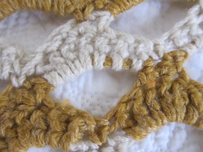
The poncho is made from a 3 ply commercial woollen knitted yarn in two colours. Elastic has been used to tighten the neck. There is no label as it was crocheted and given to me by my grandmother in the early 1970s. In order to preserve this textile the guidelines would be the same as for the cotton bedcovers. Wool repellent can be used if not directly touching the garment. Handknitted woollen garments should be washed by hand in cold water to avoid felting or shrinking.
2. What methods have been used in its production?
The woollen thread is commercial and would have been produced by carding, combing, drawing and spinning raw wool. It has also been commercially dyed. The poncho is hand crocheted with elastic inserted at the neck.
3. Where is the textile from?
As Australia was been a huge wool producing country when the poncho was made in the 1970s, I think the wool would have been Australian made. The main knitting wool manufacturers then were JP Coats who had merged with Patons in 1961.
4. What problems have you encountered in trying to find out this information?
I know some information from my personal connection with the garment. As the older generations in my family are no longer living it is not possible to verify all the information or to gain further details. The absence of knitting wool wrappers makes it difficult to know the exact product details.
Purse
This slideshow requires JavaScript.
Substance
1. What is the textile made from?
This purse is made from modern fabrics, polyester or a poly/cotton mix, the outer fabrics, base, interfacing and lining with a polyester cord and nylon zip. This item was given and received with the intention of everyday use. A damp cloth could be used to wipe it clean. It could be machine washed on a gentle cycle, however, it may not be colourfast. If this textile was to be kept as a piece to be archived then it would require the same care as the previous textiles.
2. What methods have been used in its production?
The fabrics have been commercially produced and dyed. There is cardboard in the base of the textile and the base fabric has a sheen as does the cream coloured fabric. The purse has been totally machine sewn with the use of fabrics in a decorative pattern on the exterior.
3. Where is the textile from?
The textile was purchased at a market in Northern Thailand from a member of the Lisu tribe. It is likely that the fabric was produced elsewhere in Asia, possibly China. Lisu purchase fabric to make their own clothing from nearby markets. The Lisu people used hemp in the past, to make their own clothing, which has given way to cotton.
4. What problems have you encountered in trying to find out this information?
The exact source of the fabric is difficult to be certain of. Some of the other information has been easy to find as it is a recent purchase given to me as a gift by a friend. Generally the Lisu textiles are very brightly coloured, however, my friend chose to buy a more monochrome colour scheme.
Twin Bedcovers
Story
1. What other visual indications can you glean from closely examining the textile samples? If the textile has been made into a product, what can you learn from further visual examination?
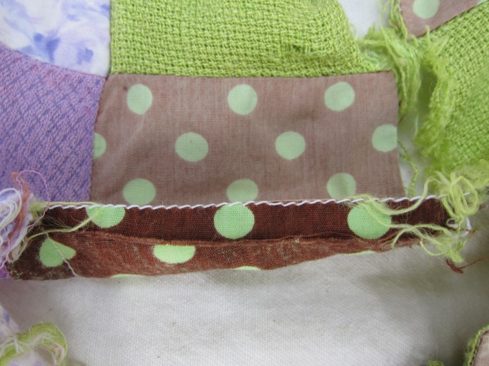
The bedcovers were made around the mid 1960s, possibly for my parents’ new house which was built around then. They slept in twin beds as was the case for a lot of married couples in that era. They are quite worn and faded and fabric blocks have come apart with fraying quite evident. They were a utilitarian item, not just for decoration. They were made to be durable but not to last forever. There has been an attempt to mend one of the bedcovers by using a machined zigzag stitch in a dark contrasting thread colour on top, with dark green thread visible on the back, thread tails intact. One square shows a seam where two pieces of fabric have been joined, presumably because there was not enough fabric to make a single piece.
2. Are there any elements of the design, detail, decoration or construction of the textile sample that indicate a story behind the textile or product?
The design of the bedcovers is a simple nine patch with alternating patterned and plain pieces. Curiously the textile has not been constructed in the traditional quilt method of top, wadding and backing. I wonder why that is so. Great effort has been made to match the plain colour pieces with the patterned fabric in each nine patch block, rather than randomly placing them. There is a 2 inch wide seam running the length of each side of the bedcovers, perhaps to assist them in sitting flat on the bed.
3. Nostalgia is a recurring theme in textiles and within the broader spheres of design and art. Textiles have a special role to play, as we can attach memories, experiences and sensations, particularly to the wearing of textiles or their close proximity.
There is one patterned fabric, in particular, that I distinctly remember had been used to make an apron that my mother wore. There is another boldly patterned fabric which seems familiar but I cannot quite place it. I have a very strong attachment to these bedcovers as they are a link to my mother, my childhood and my passion for quilting and textiles. I deliberately chose these items as I wanted something that I strongly connected with as an archival item. They definitely reflect my heritage and also represent an era where textiles were made to be used and to be useful, not merely decorative.
Faded
Fraying
Familiar fabric
Apron patterned fabric
Joined pieces
Mending with contrasting thread
2 inch side seam
Poncho
Story
1. What other visual indications can you glean from closely examining the textile samples? If the textile has been made into a product, what can you learn from further visual examination?
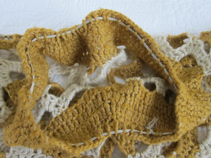
The poncho is still in reasonably good condition. There is one place in the pattern where it has come apart. The elastic has lost its stretch. There are a few loose threads here and there but no sign that any repairs have been done. It is still quite durable and could be worn even though it is now around forty five years old. I remember being very pleased and excited when receiving the poncho as a gift.
2. Are there any elements of the design, detail, decoration or construction of the textile sample that indicate a story behind the textile or product?
The garment was made to be worn yet it is very decorative with its crocheted design and two tone colour. Not being able to crochet myself, I wonder if this was a commercial design, a traditional design or whether my grandmother made it up herself.
3. Nostalgia is a recurring theme in textiles and within the broader spheres of design and art. Textiles have a special role to play, as we can attach memories, experiences and sensations, particularly to the wearing of textiles or their close proximity.
I did not originally think of using the poncho as an archival item, in fact I had forgotten that I still had it. Although I was very pleased to receive it I don’t remember wearing it a lot as I think that it was heavy and itchy! It definitely links me to my past in terms of connection with my mother and grandmother and their skills at producing everyday items that had a purpose yet were beautiful to look at.
Elastic in neck
Hole in garment
Decorative yet functional
Purse
Story
1. What other visual indications can you glean from closely examining the textile samples? If the textile has been made into a product, what can you learn from further visual examination?
I am interested in the visual indicators indicated by this sample in terms of its historical design links. This purse has been produced for commercial purposes by the Lisu tribe who sell them at markets to boost their economy. This mountain dwelling tribe have became more dependent on tourism income from the 1970’s as their colourful costumes attracted travellers and NGOs also encouraged development of craft production and sales.
2. Are there any elements of the design, detail, decoration or construction of the textile sample that indicate a story behind the textile or product?
I have spent hours trawling through images, websites and texts trying to ascertain whether the design on this purse emanates from a traditional design. There are images of modern day Lisu costumes with similar geometric designs. The closest I can find in images from around the late 1990s are horizontal stripes of coloured fabric and geometrical shapes in their traditional costumes. As the Lisu people were fairly isolated until the 1970s it is possible that their dress was not photographically documented until more recently.
3. Nostalgia is a recurring theme in textiles and within the broader spheres of design and art. Textiles have a special role to play, as we can attach memories, experiences and sensations, particularly to the wearing of textiles or their close proximity.
I think it is fascinating how the Lisu people have adapted their textile designs to produce income in the modern era. The horizontal stripes, sawtooth strips and vertical coloured blocks have some connection with their past. I chose this item to make the link between the past and now and how what is new now will become archival in the future, although, not strictly traditional.
Bourgeois has used such a range of techniques it is difficult to record my observations. I did not like one group of dryetchings as the subject matter and the flowing hair does not appeal to me, however, I quite liked another group of black ink prints from the series ‘Nature Studies’ which consisted of simple organic lines.
1941-46
Various
Aquatint, Drypoint, Etching
2009
Nature Study
Drypoint
Alison Carlier
Carlier’s technique of audio drawing, enabling people to listen to paintings, connected with some of the vocabulary that came to mind in my Nature’s Larder brainstorm; water… ripples/waterfall, rush/twig…snap/river, trickle/scrunch, leaves/flames…crackling. It highlights for me how other senses beside vision are involved in our observations.
2015 Performance at Art Language Location
Hilary Ellis
I was surprised at Ellis’ works had an immediately calming effect when I viewed each one. The muted tones, exclusive of a dash of colour or bold line, created a still energy within me which I relished. Sometimes though I want art to excite and to feel a more lively energy.
It’s a Grey Day (2017) Mixed Media 84cm x 84cm
Debbie Smyth
Smyth’s thread works had elements that I am often drawn to; simplicity, boldness, clean lines, monotones and presence. They did not appeal to me though and I think it might be the starkness or the large amount of negative space on a large scale which make them appear unfinished and cold.
2010 Red Cross Canada
Katie Sollohub
The prevalent use of colour by Sollohub in her work from her residency at Borgo Santo Pietro creates a vibrancy which reminds me of David Hockney’s work. I like the warmth of her paintings and found I didn’t know which part to focus on first and my vision was constantly moving around.
2017 Residency at Borgo Santo Pietro
Roanna Wells
I love the order, symmetry, geometric aspects and the subtle tones in Roanna Wells’ work. I was going to try to be more free flowing in my approach but this way of organising really resonates with me.
2016 Brushmark Series Watercolour
Links to my own drawing
I don’t know that I can make any strong connections, at this stage, with observing qualities in my introductory project, and that of the artists above, despite having researched them prior to the process of observing qualities. I think I was focused on simply recording the qualities of the items without trying to reproduce them.
Now that I have revisited these artists I can see that I could take individual elements of my work to generate new ideas. For example, I could take a simple line and develop it as a mark as Louise Bourgeois and Hilary Ellis do. I could develop the leaves as watercolour brushstrokes as Roanna Wells has done. I am not sure that an audio piece, such as Alison Carlier produces, would be suitable for vegetables and herbs as they tend to grow silently! I cannot see a connection between the work of Katie Sollohub and mine although with different media and colour a connection may occur. I can imagine using line and thread as Debbie Smyth does with the curly gourd as the focus.
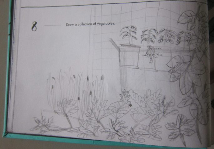
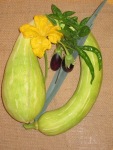
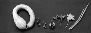
I initially planned to use a range of grasses, that I had collected at a farm, for my Nature’s Larder. As I was brainstorming, my thoughts turned to the vegetable garden in my backyard and some interesting curly squash that were growing, along with other herbs & vegetables, so I decided to use those. I loved how brainstorming led me down a different path!
Spring Onion
Basil
Curly Squash
Bee collecting pollen
Chilli
Eggplant
Mint
The gourds have been the source of many a laugh due to their curly form and size. Other vegetables and herbs in the garden include spring onions, chillies, basil and mint. Each of these have their own particular appearance in terms of surface, form, size, texture and colour which will create visual variance. I am often drawn to the natural aspect of the environment and can envisage these objects sitting on an earthen or green textured background. I have several papers and fabrics in mind that would fit this theme. I would like to showcase the items in my Nature’s Larder.
Viv January 2018 Pencil The vegie garden
Centred arrangement Hessian background
Vertical linear arrangement Hessian background
Offset gourd Bunch arrangement Wooden board
Offset gourd Bunch arrangement Soft wrapping paper
Spread out arrangement Japanese fabric
Japanese fabric close up
Spread out arrangment Jacquard fabric background
I was disappointed with all of the above arrangements. The backgrounds did not add anything to the objects in terms of texture and did not showcase the objects. I took these photos inside in dull light which did not allow the texture of the paper or fabric to show up. My initial attempt at bunching the objects did not emphasise their form, perhaps because they were all different. The gourd tended to dominate the other objects. I preferred the horizontal linear arrangement as it better displayed the variety of forms. I thought the spread out arrangement was alright but not cohesive enough.
Horizontal linear layout Corded cotton
Close up
Fabric close up
I was most pleased with this arrangement on this background. The darker background emphasises the contrast and variety of form, size, scale and colour and gives a richness to the objects. The fabric itself has a vertical linear texture which is complementary. I like how the light hits the eggplant and chillies which highlights their surface features. Again it was difficult to get a true interpretration in the dull light.
Gourd dominant Horizontal linear arrangement Jacquard
B & W
Gourd dominanat Spread out arrangement Japanese fabric
B & W
Horizontal Linear arrangement Corded cotton
B & W
I decided to take these photos outside with brighter natural light and I used my tablet. I had been concerned that the colour was dominating my impressions and so edited the photos to black and white. I still prefer the grouping on the corded cotton background as it displays the objects clearly and defines their individual features. I like the starkness and clarity of the objects. The texture of the Japanese fabric, which incorporates paper fibre, is much clearer in these photographs and adds a pulp like element which complements the vegetables and herbs. I loved the rich jacquard fabric as a background colour and I think it really enhances the spring onion and eggplant, however, I think it loses that richness in black and white. The shiny surfaces of the chillies, eggplant and basil are evident but the mint tends to get lost. Although the gourd is dominating, it provides a contrast within the group.


